
Over the course of the 2019 summer I was a George Washington Carver Intern for the World Food Prize Foundation in Des Moines, Iowa. They are an international non-profit that award highly distinguished members of the agricultural community for their work in solving food problems. You can read more about the WFP here and all of the amazing work they do! I worked in their communications department as a graphic designer creating media such as print materials, social media and web graphics, and environmental displays. There were a few other odd jobs they had me do as well such as event staffing and helping out in general. I’ve put a few of the different projects that I had the privilege to work on with some short descriptions detailing my process below.
Working for an international non-profit was different from my other projects in the sense that my work was going to be distributed to people in the upper echelon of their fields all over the world, and these people have very high standards for their design. I had to take into account the expectations of what a well designed story would look like from the perspective of everyone from a seedsman in Scandinavia to a vegetable farmer in Cambodia. To say that designing for this broad of an audience was new for me would be an understatement. It took a lot of new ideas, revisions, and critique for me to create something exceptional. I firmly believe that over the course of my internship here I have become an exponentially better designer and I am grateful to everyone at The World Food Prize for giving me this opportunity.
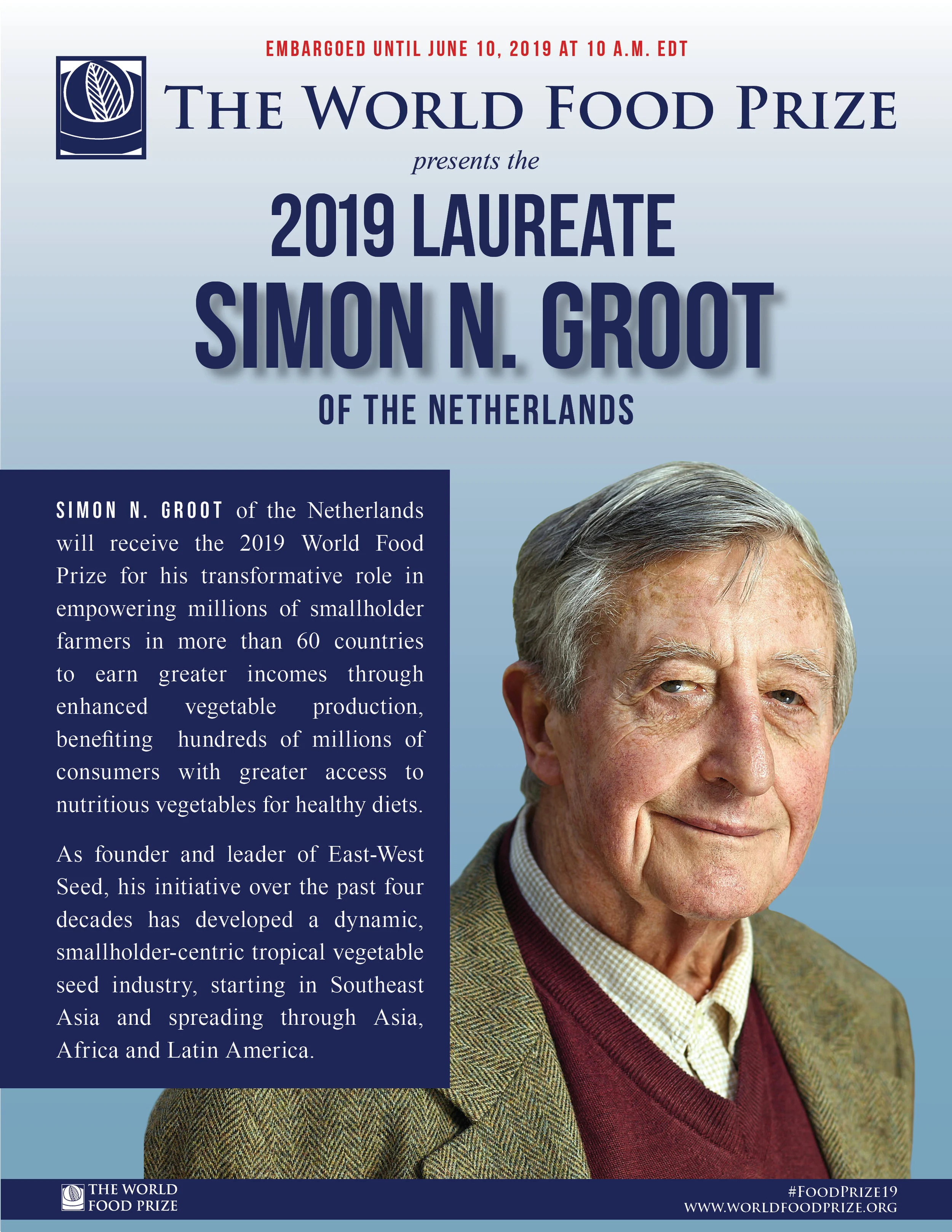
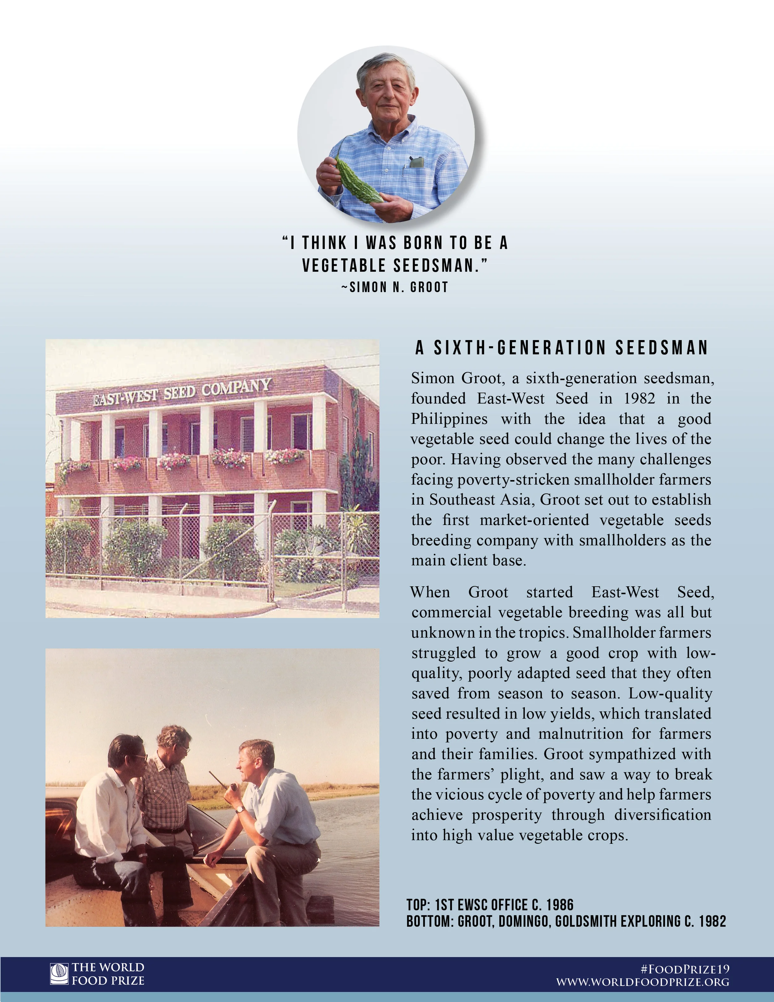
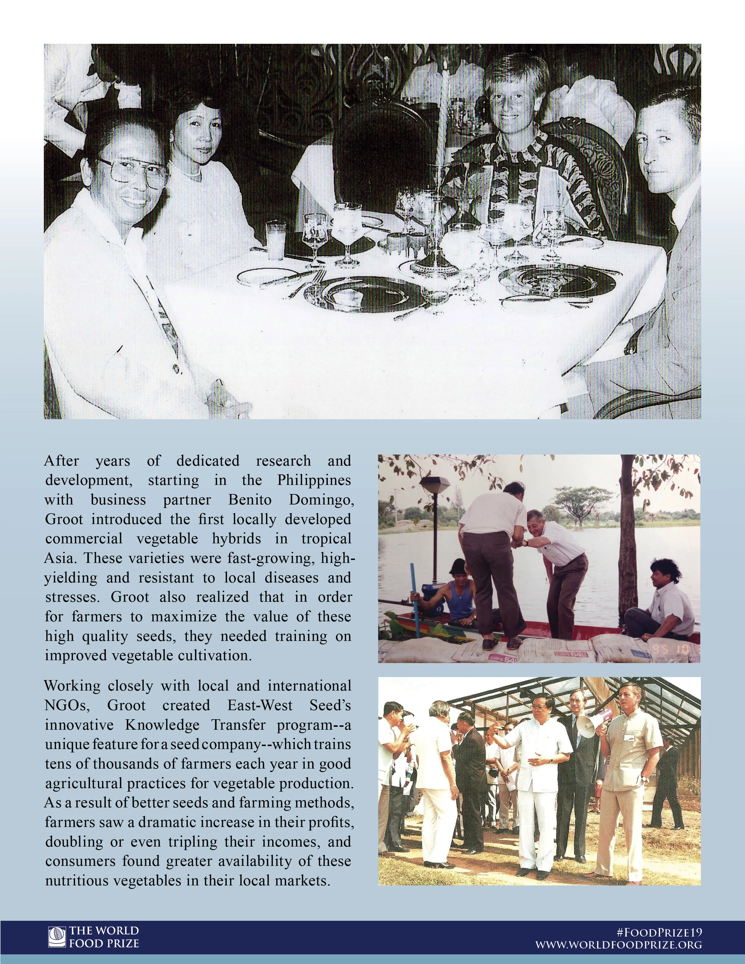
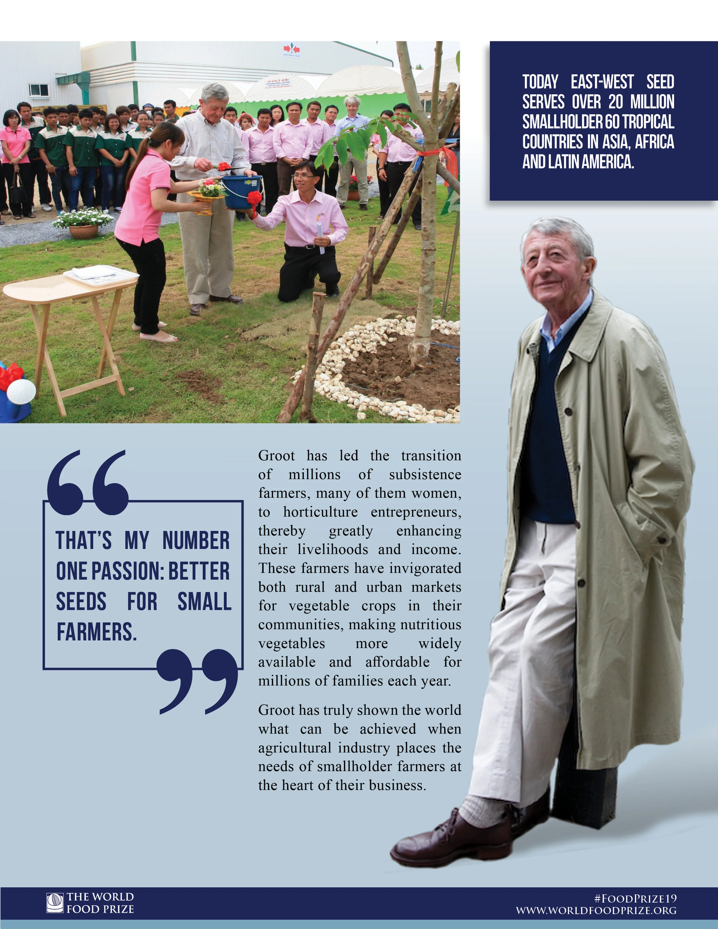
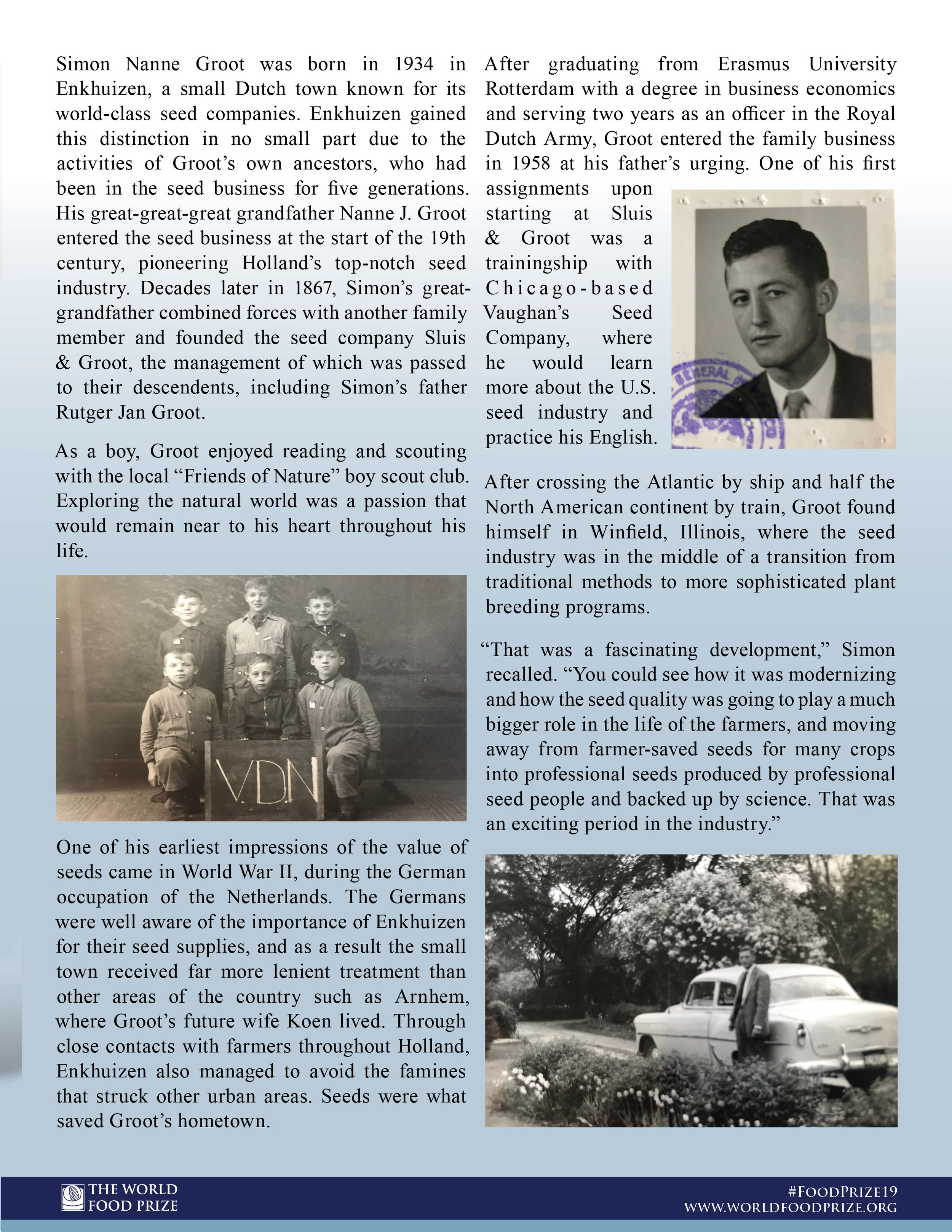
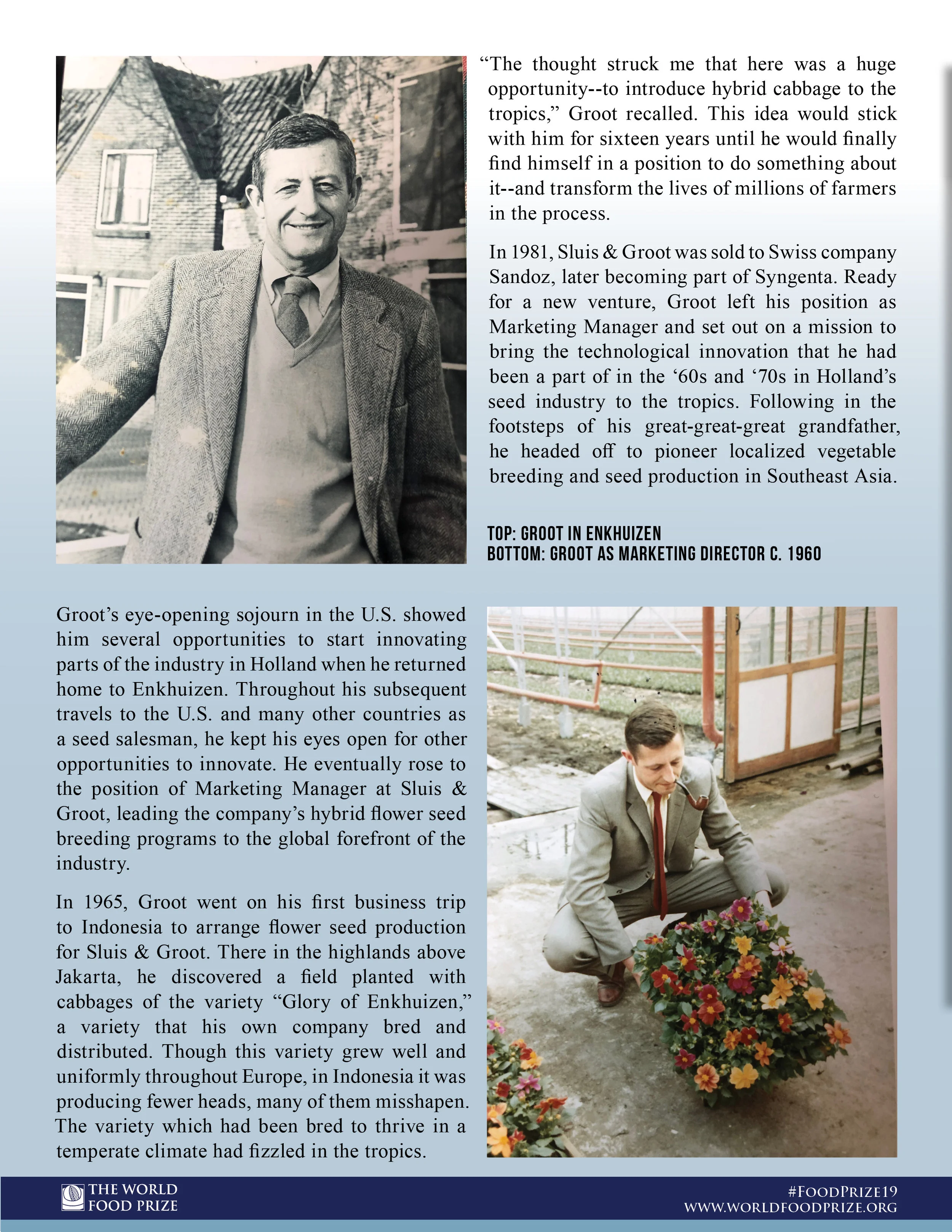
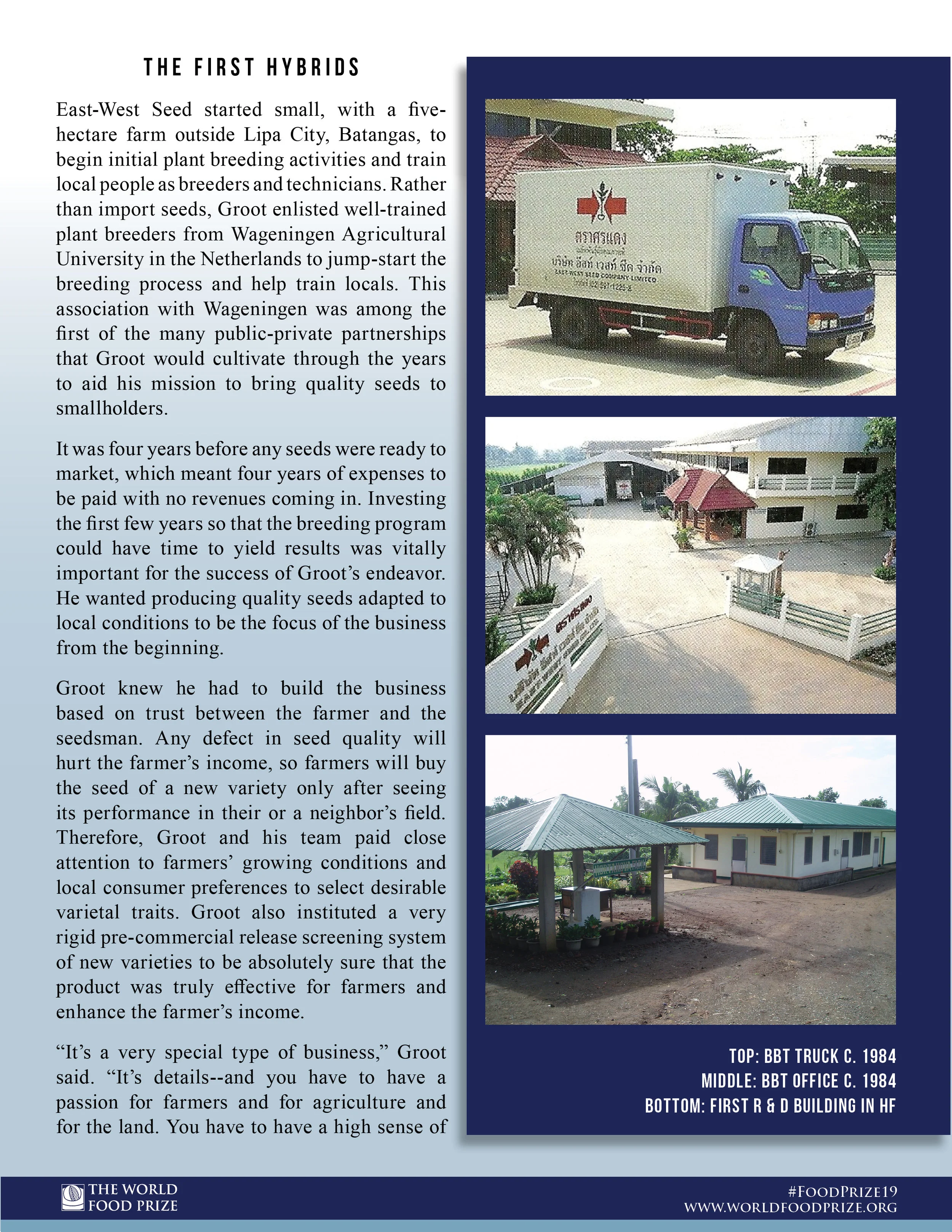
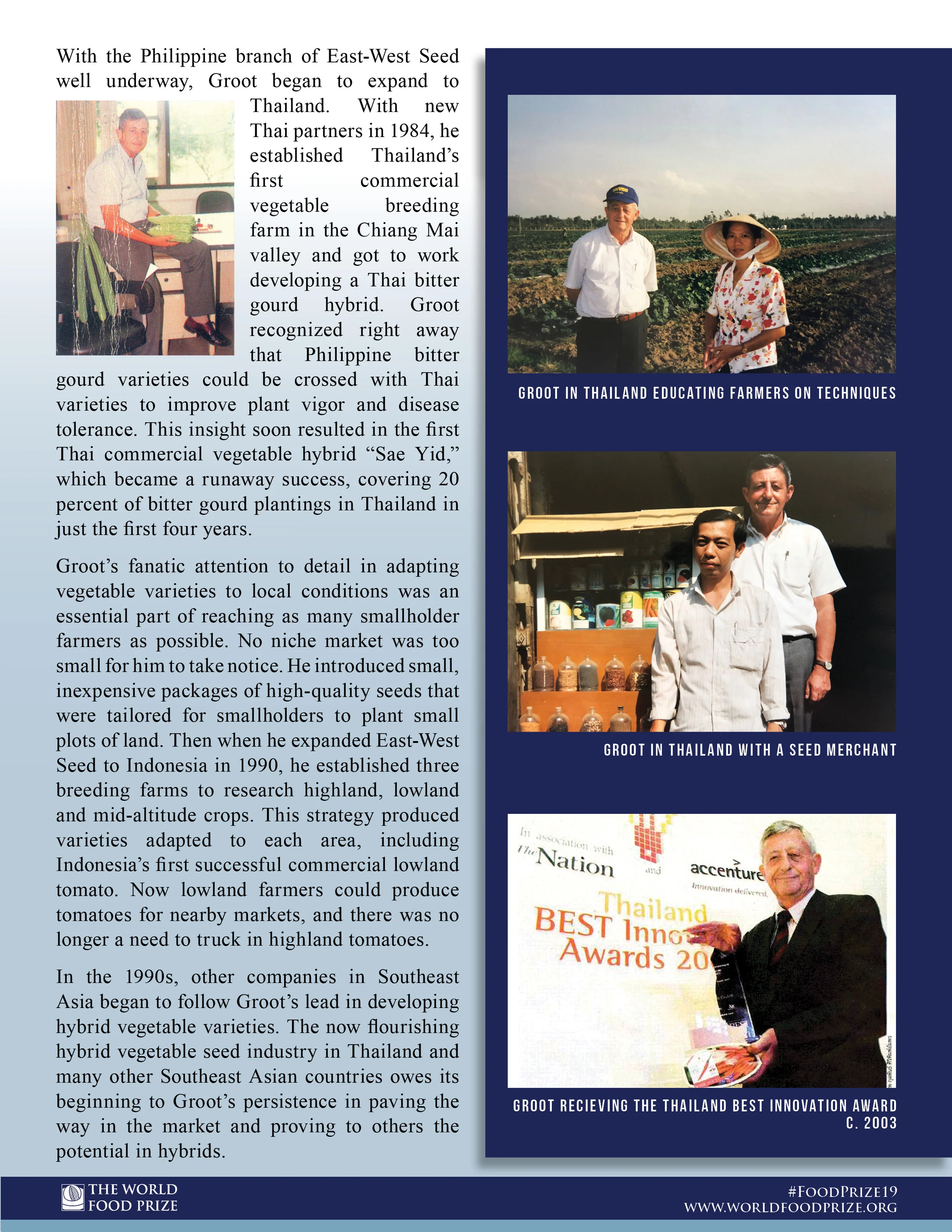
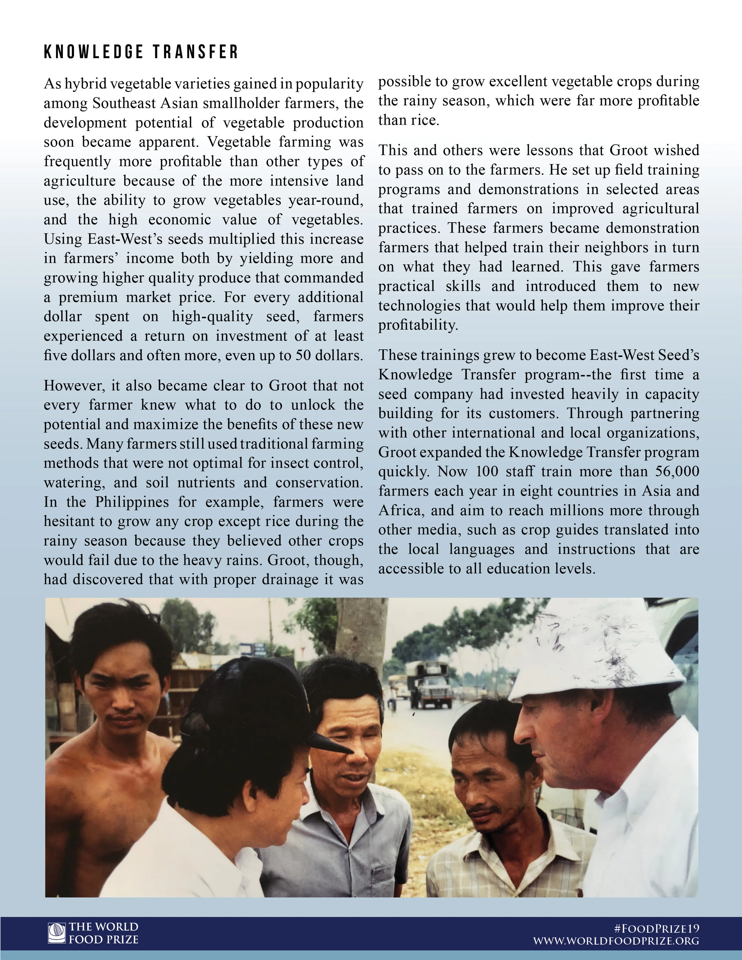
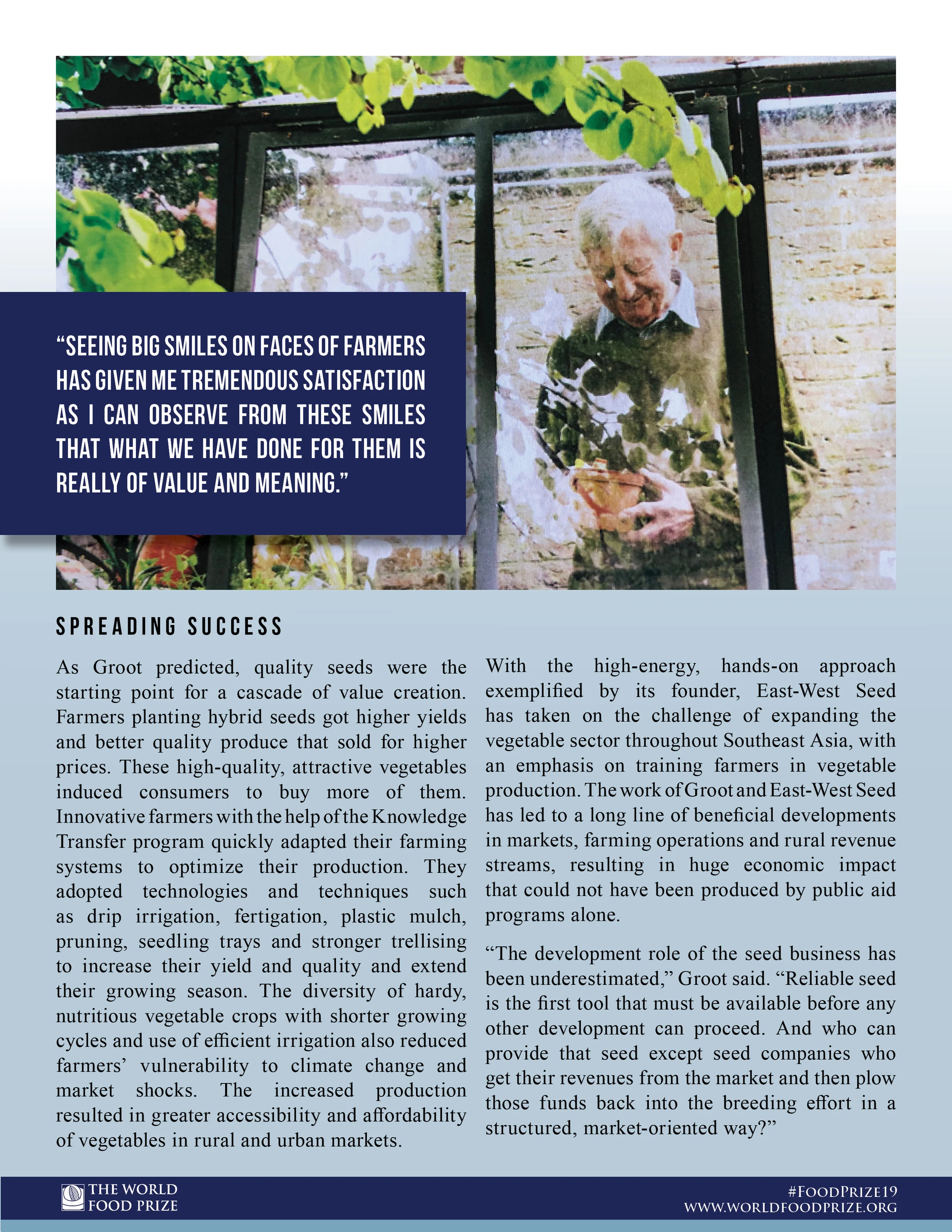
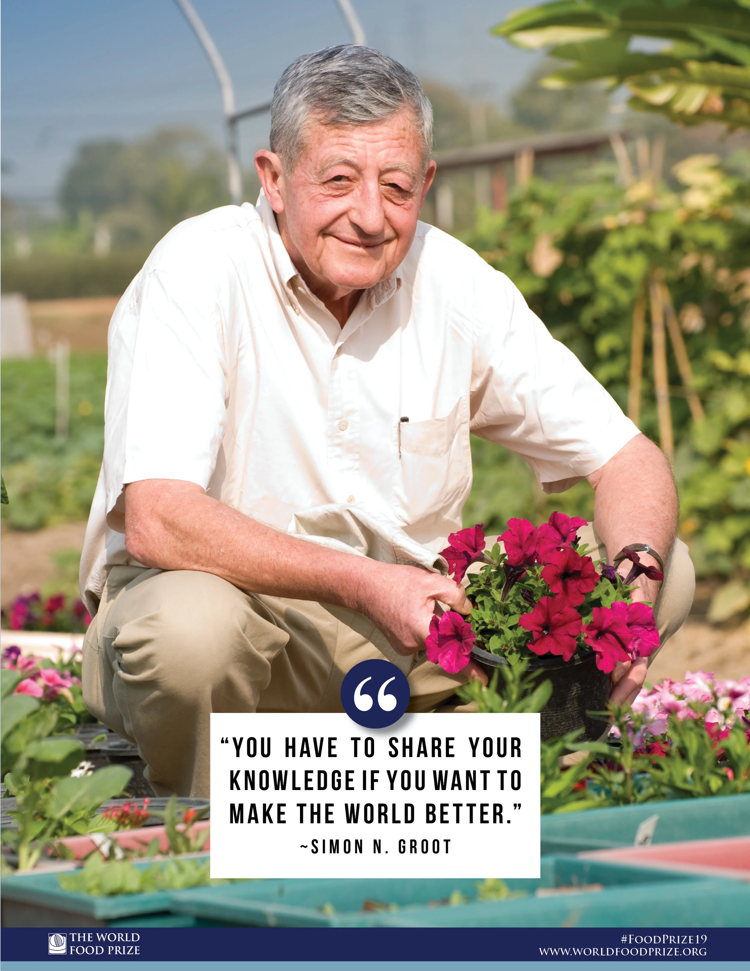
This is the first big project that I was tasked with creating at The World Food Prize. It details the life story and achievements of the 2019 laureate for the prize Simon N. Groot of the Netherlands for his work helping to feed millions and bring greater economic stability for the farmers that grew his crops in Asia.
It was very important while I worked on this project to make sure his identity remained a secret. This made doing test prints and getting feedback difficult even from people within my office. It was a new caveat added to my workflow that up until this point I hadn’t had any experience with. I solved this problem by relying on my experience with historical treatments of type to inform my decision making and getting feedback from as many people as I was allowed to. With so much type to work with and pair with specific images, I had a lot of non-design related specifics to adhere to as well. Due to this issue I started my design process from a “big-picture” standpoint to ensure that the story would make sense as the viewer progressed along with the images.
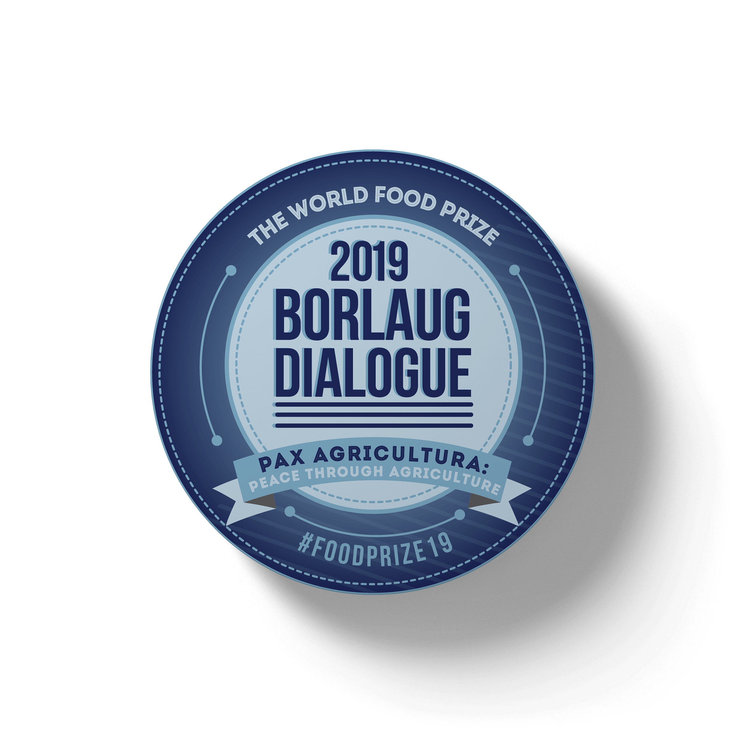
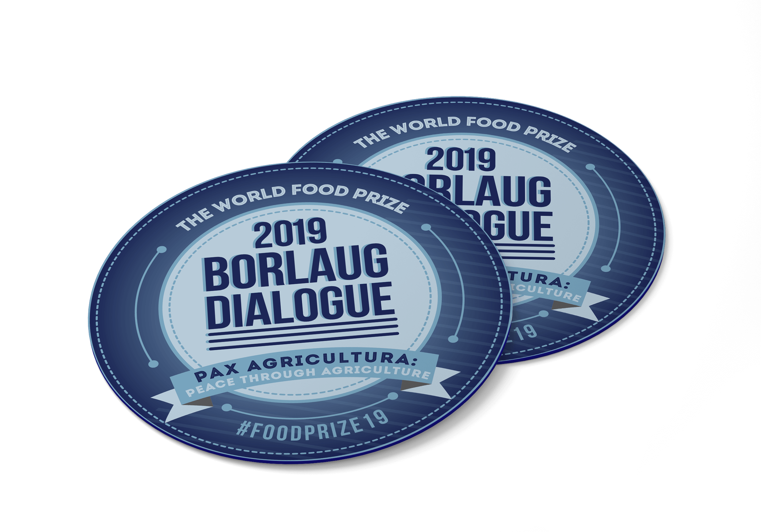
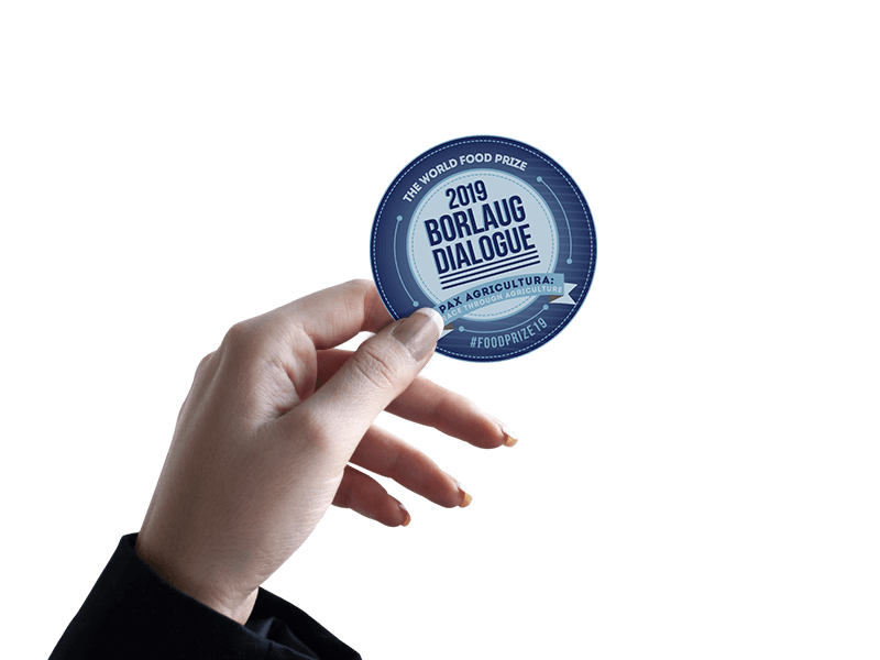
This project is a sticker design that was given out at the 2019 Borlaug Dialogue. A big part of this design was trying to make something that people would want to put on their belongings. I went through a lot of different versions of this idea before deciding that this was the one. It feels great to see something I made on people’s laptops and binders.
Design development for this sticker relied heavily on user input. My audience was so diverse as it consisted of international agriculture people as well as high school students. Making sure that this sticker was something that everybody would get use out of was of the utmost importance. After all of the rounds of revisions and testing we were all happy with the final result.