Data Business Equipment, Inc.
Identity & Branding
Print Projects
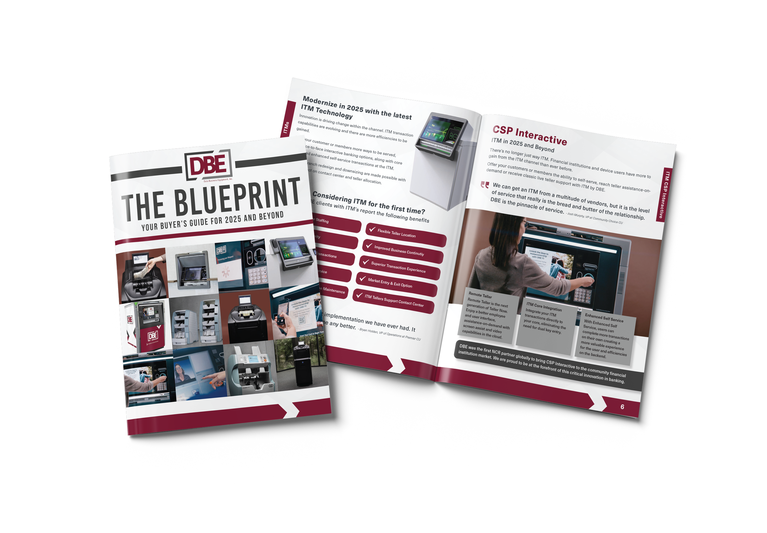
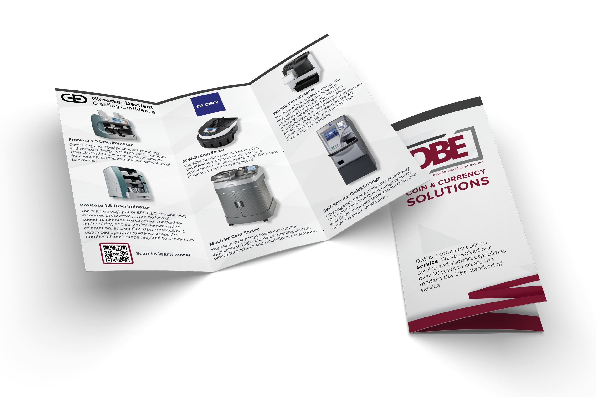
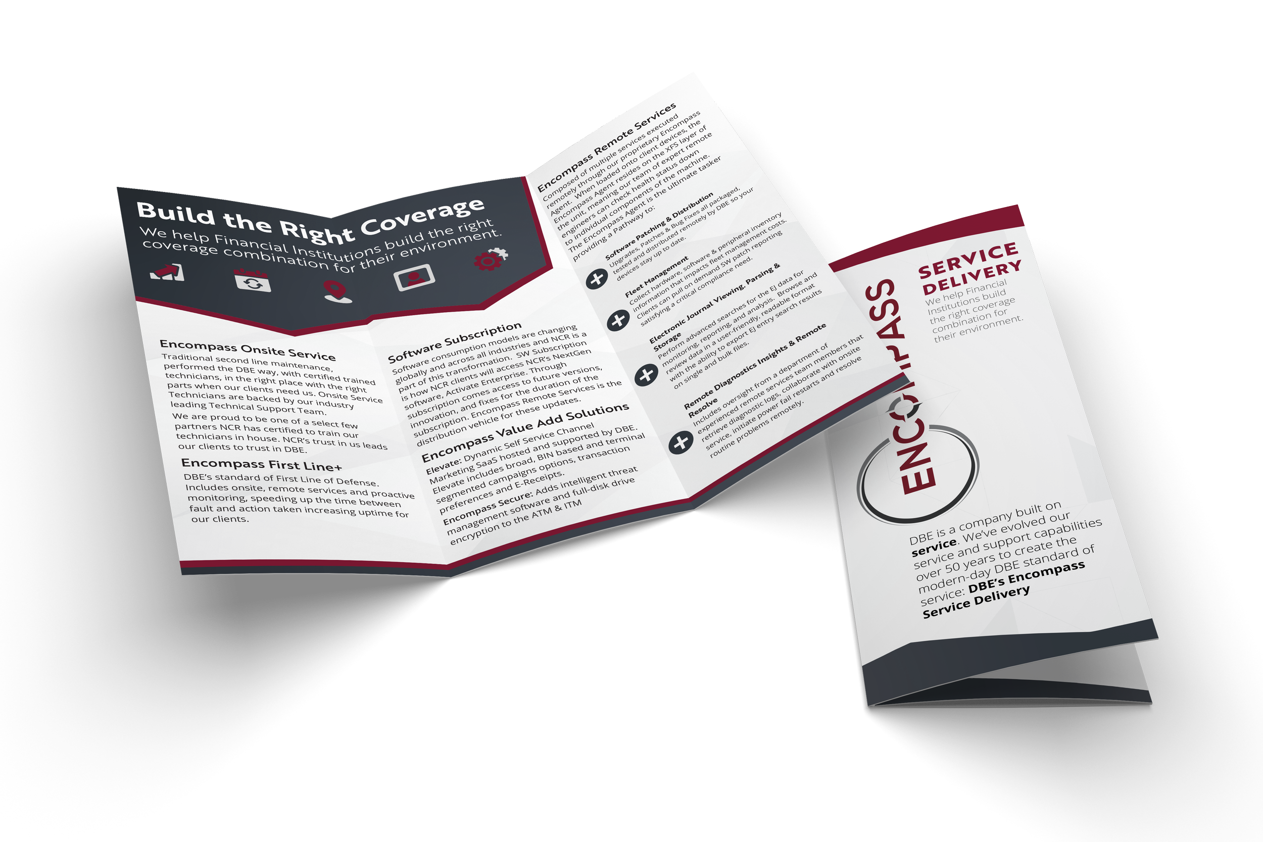
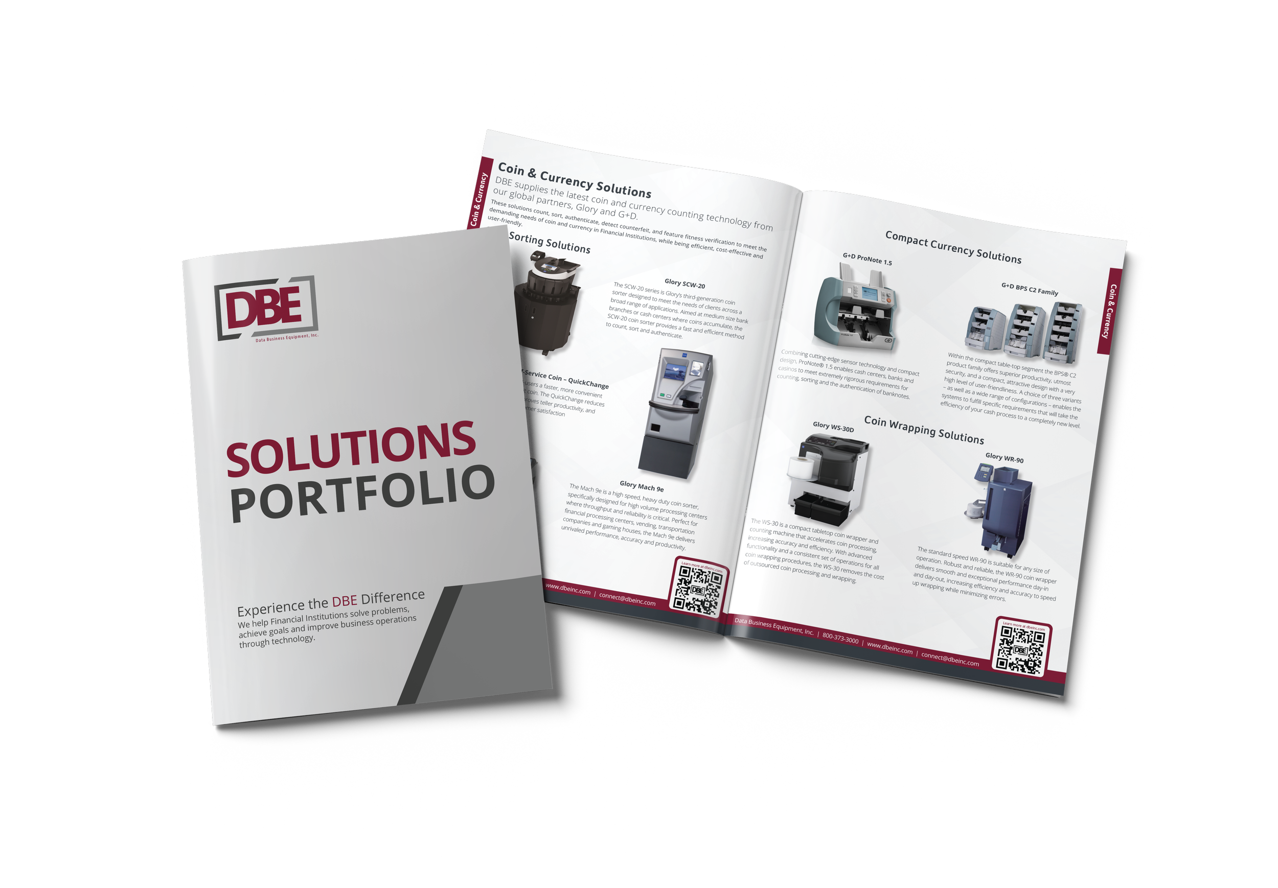
DBE’s brand is clean and modern, employing bold type and a restrained palette of colors. Within the print projects I worked on at DBE, our focus had to be on letting the content be easily accessible for our customers. The focus of each piece differed in content, but implementing consistent brand guidelines across all media kept each piece cohesive with the rest.
Because the amount of information we need to share per piece of print media, I introduced contrast as needed to fit our brand guidelines, then carefully fine-tuned letter spacing and adjusted weight at small sizes to improve overall legibility and preserve visual balance. The end goal of course being to give the end user the best chance at getting the information that they needed quickly, and knowing who provided it for them.
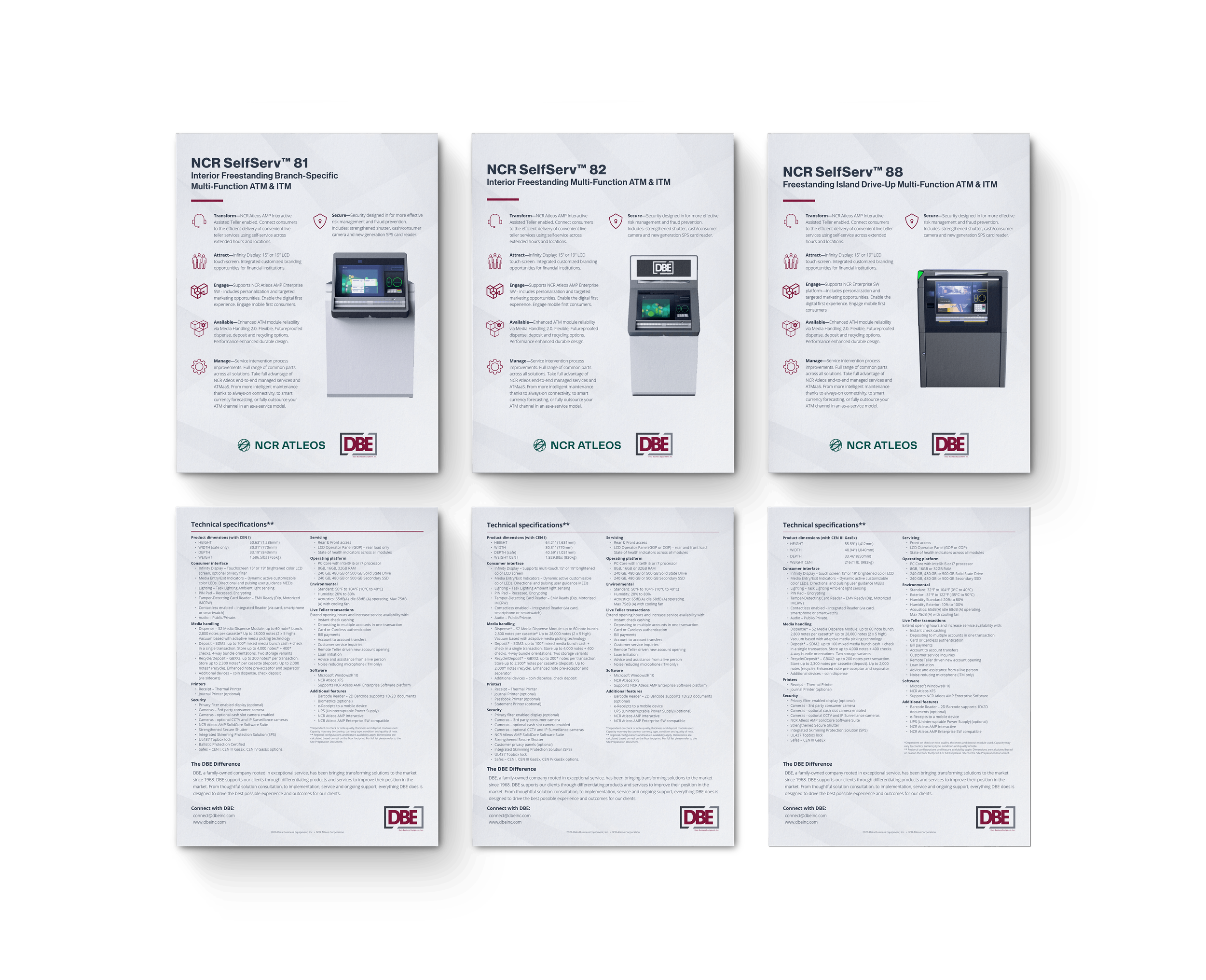
My work often required adapting dense information from vendors and partners and condensing it for customer use. Taking into account the use cases for each piece of work is critical to it’s success.
Each user of the content has different goals and I aim to appease each. Our vendor required the information to be displayed accurately, we needed to fit this content into our brand, and the customer needed to be able to quickly reference the technical information & benefits for their own use.
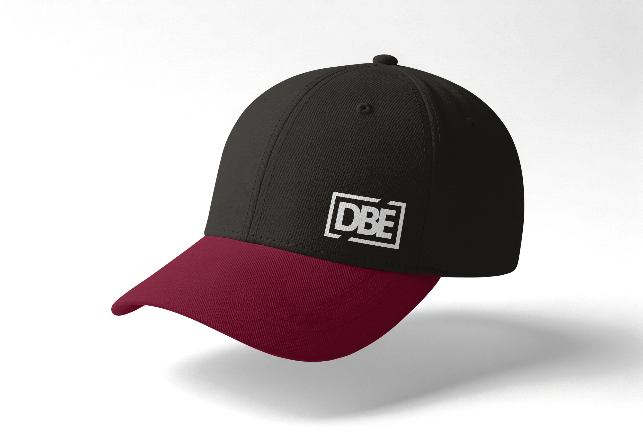
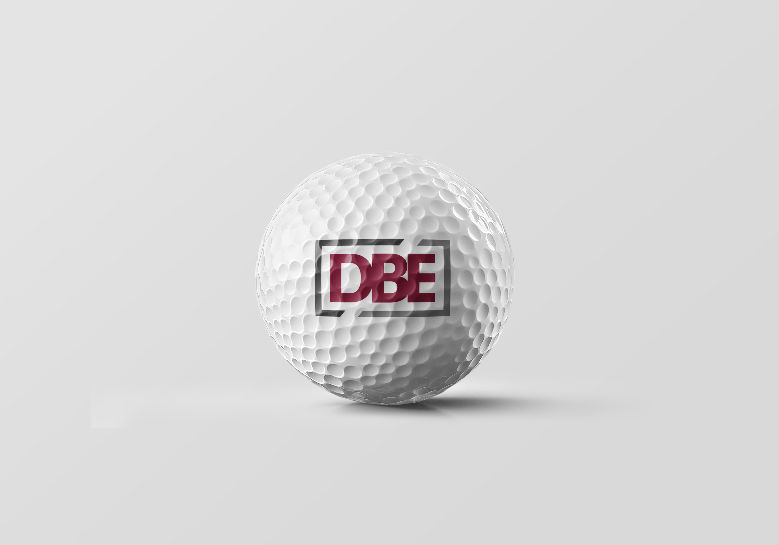
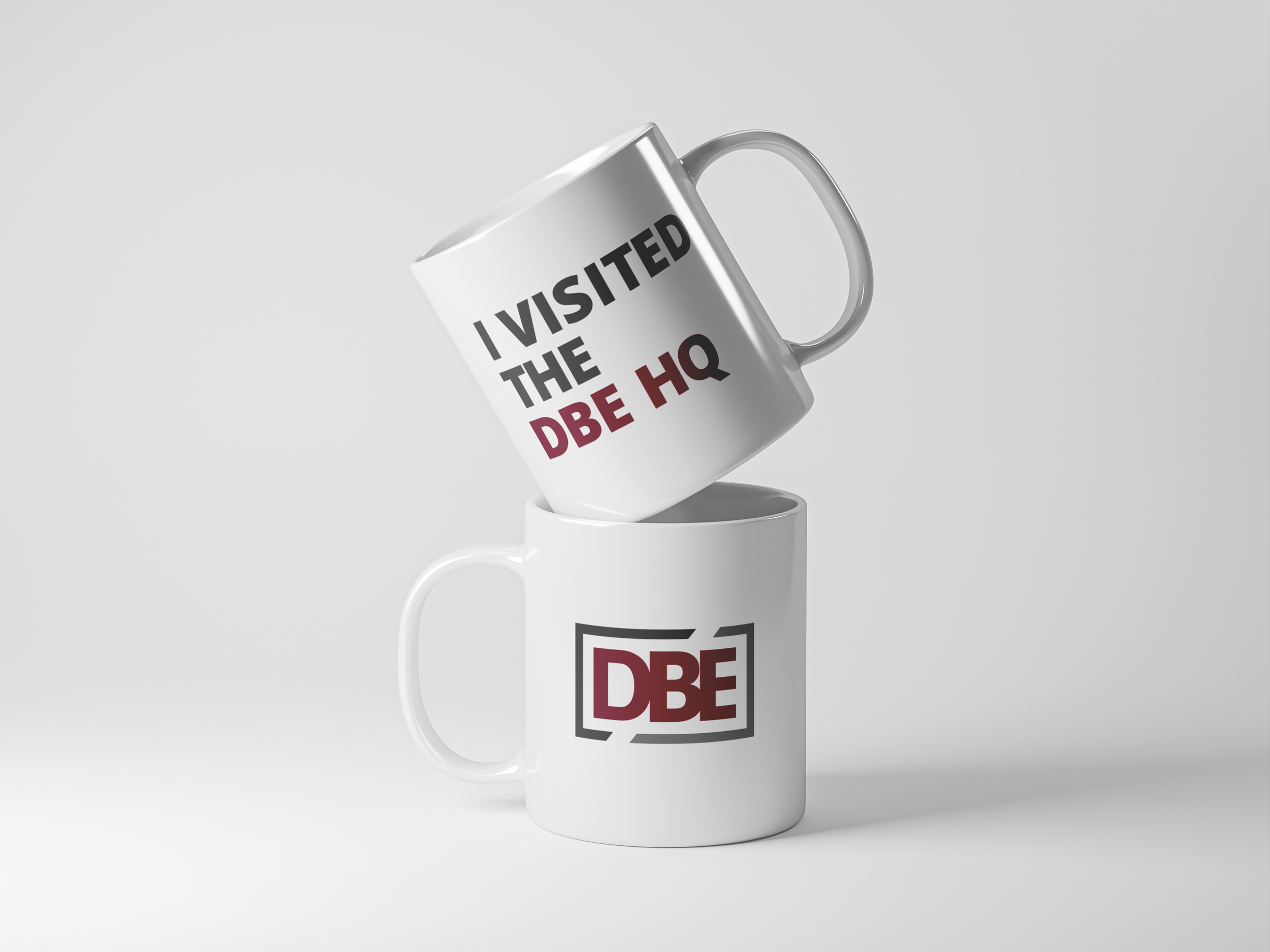
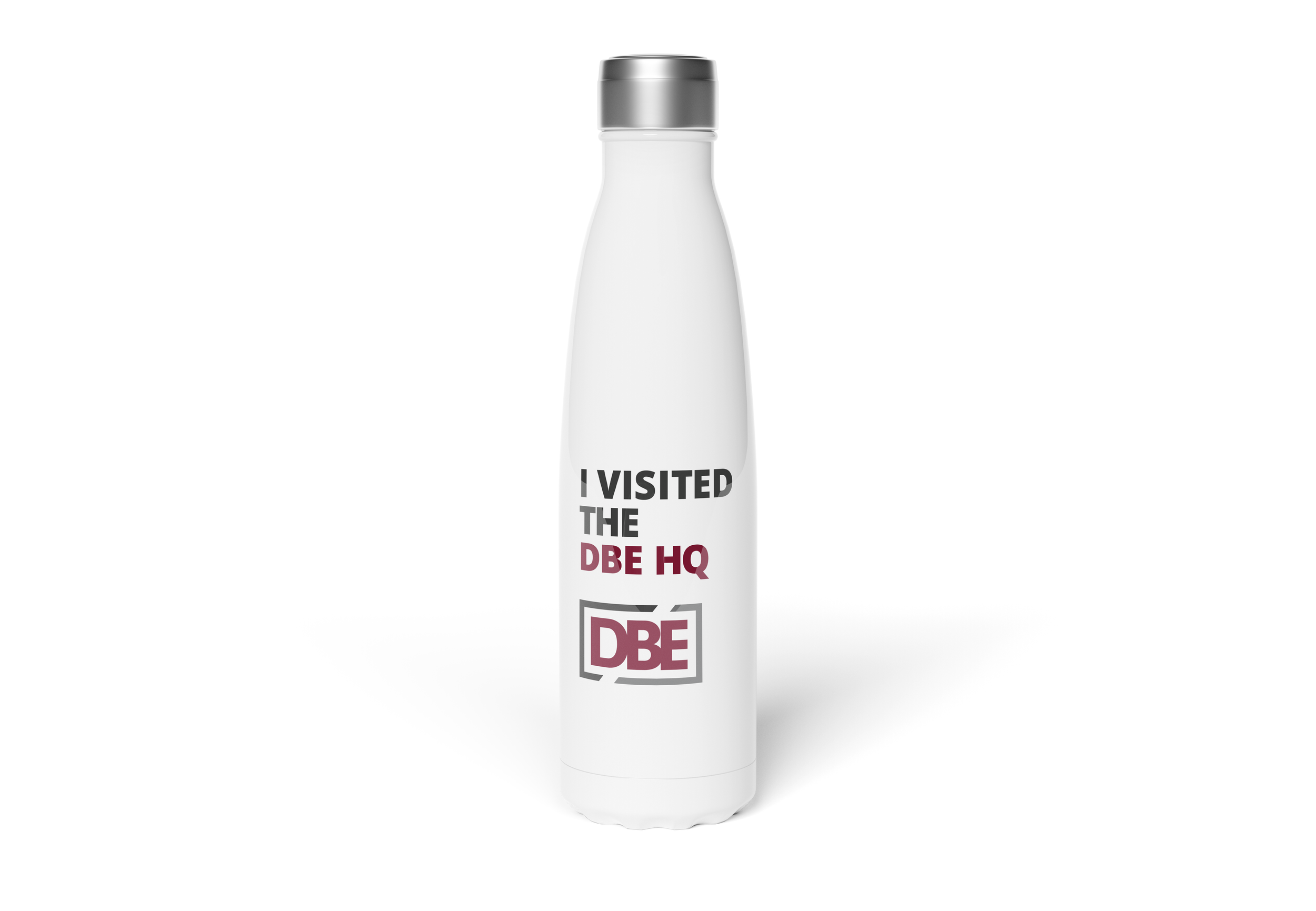
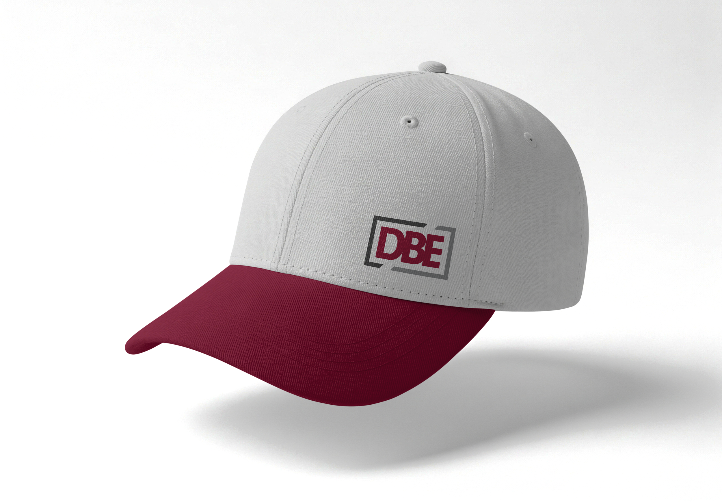
Branded Items
Video
Looping video animation showcasing DBE’s Technology and service applications.
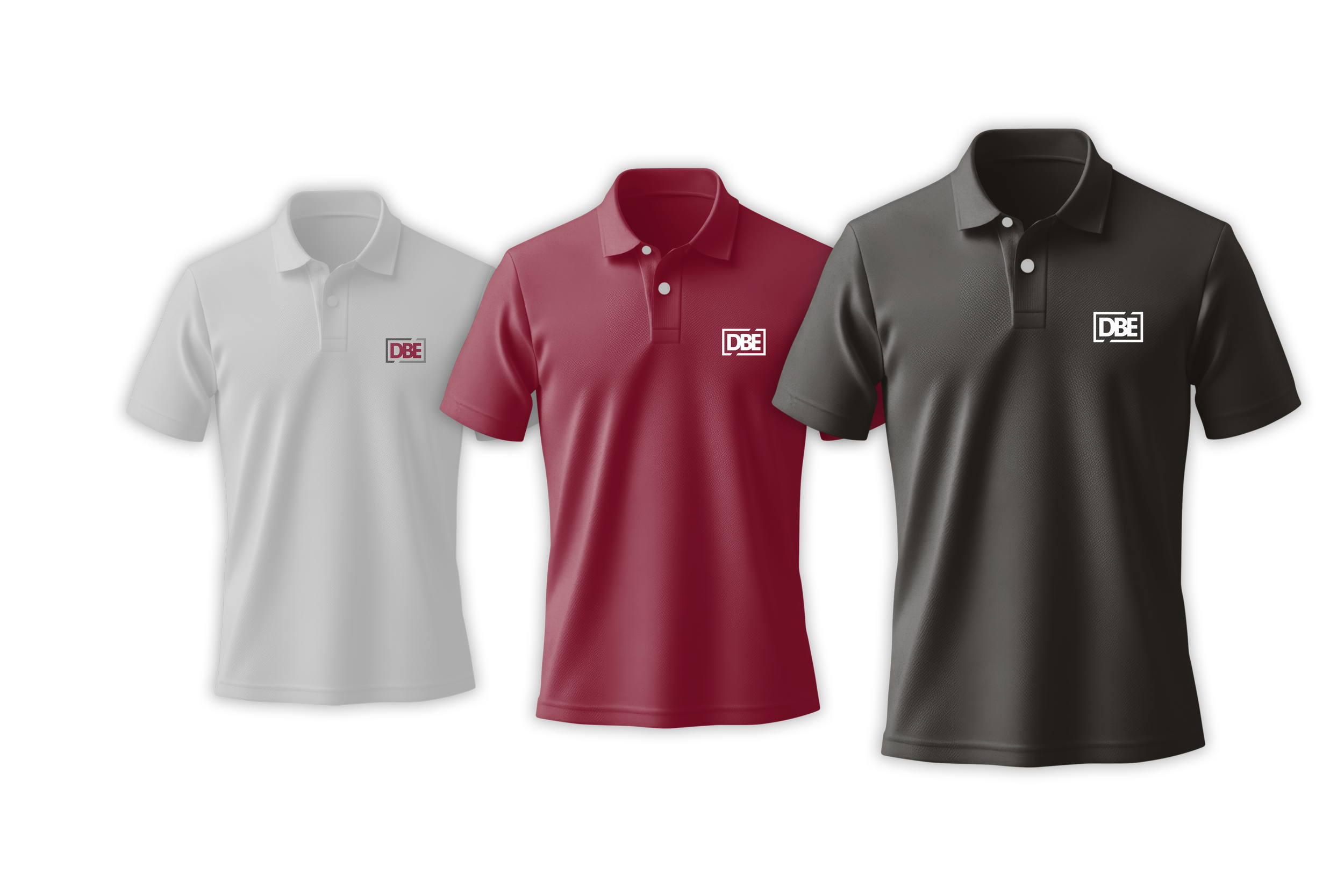
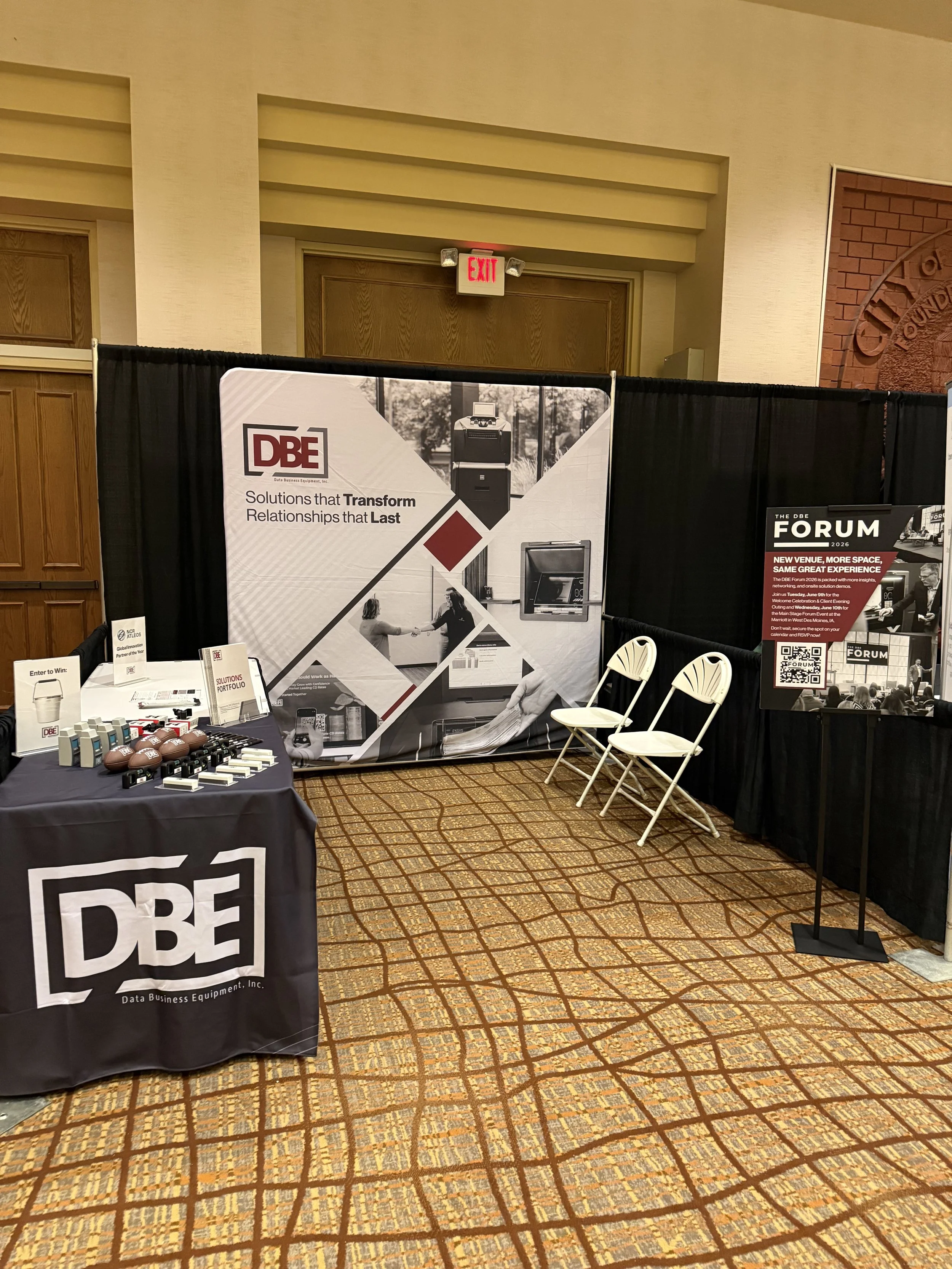
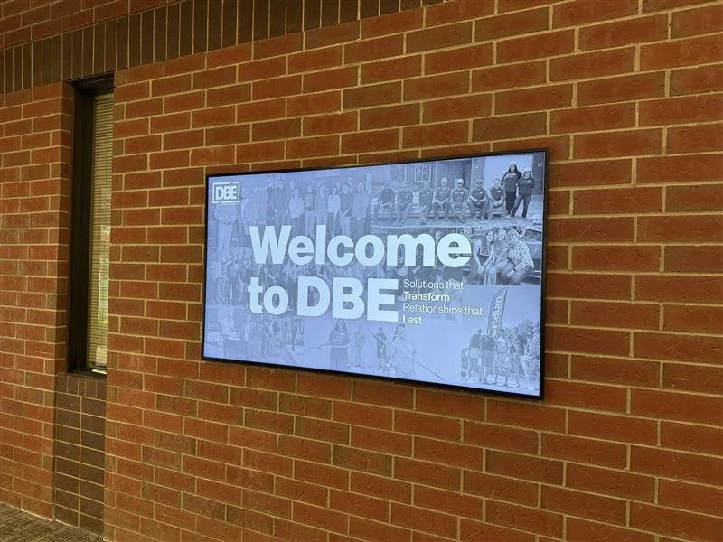
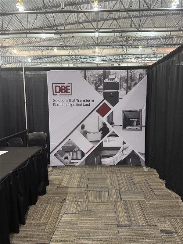
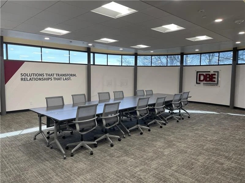
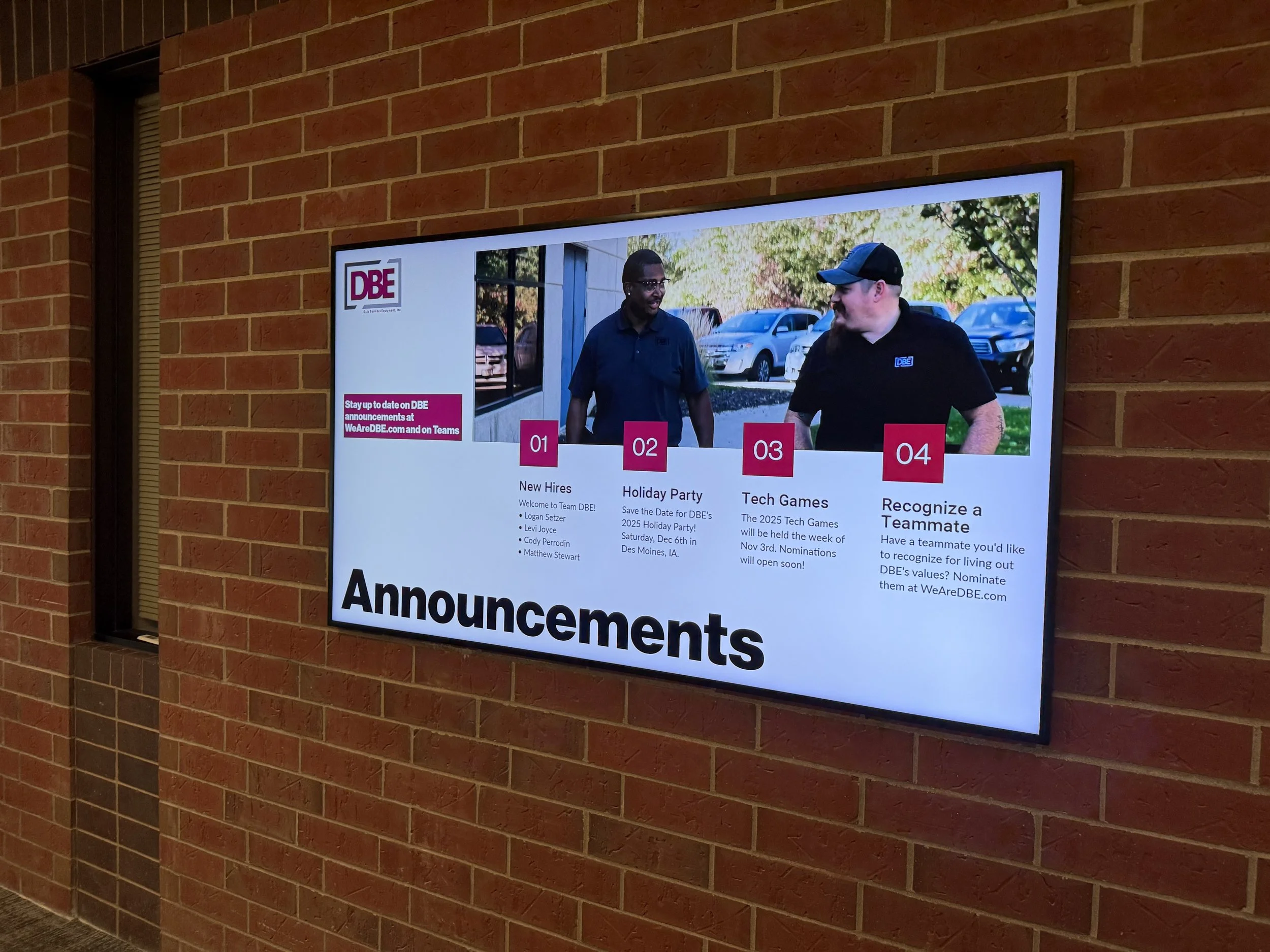
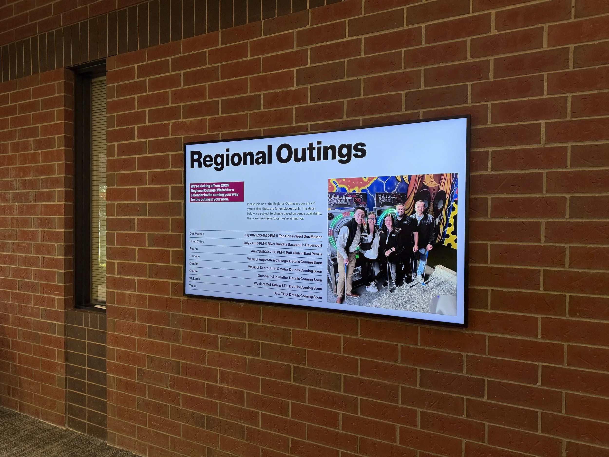
The DBE Brand in action
Applying the DBE brand into physical mediums is where the success of the brand can really shine through. The progress of the brand over the years has been significant and I am proud to say that I had a part to play in the evolution.
Award Winning Branding
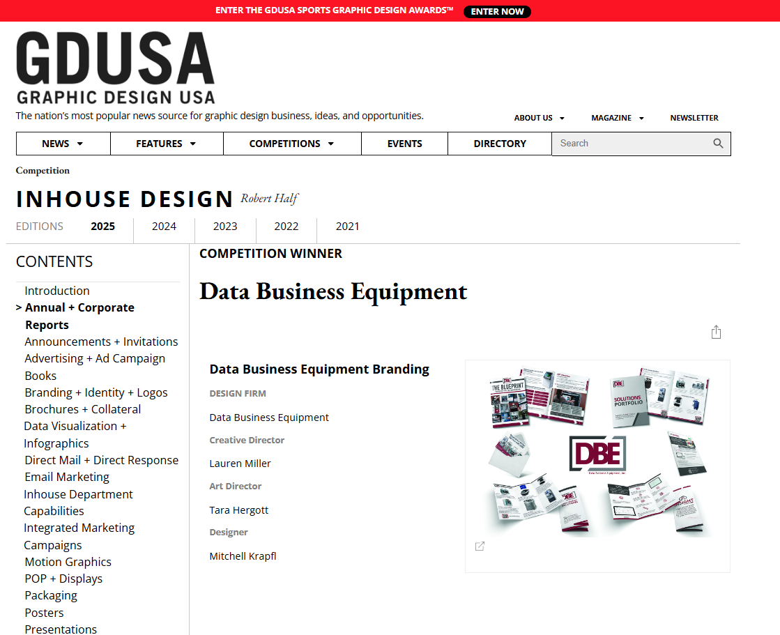
2025 GDUSA InHouse Design Award Winner
After submitting the DBE brand to the GDUSA InHouse Design Awards, the DBE brand was selected as a winner in their Branding & Identity category!